4.19.2010

two for one...

heres a couple of small pieces recently -
The first for Milwaukee Magazine about the city being lumped into a real estate survey with some other, larger cities. Sort of the odd man out. heres the piece and the layout - i wont trouble you with roughs, but there were lots. - got to do some block printing in this piece, so that was fun
the second piece is for BCBusiness with the specific brief of "sharing green ideas". it appears very small so i wanted it to be clear. usually that means something graphic in my mind. heres the final and a few roughs:
sidebar - this thursday is the Sheridan Grad show - i hope everyone that can makes it out and supports these new grads!

4.14.2010

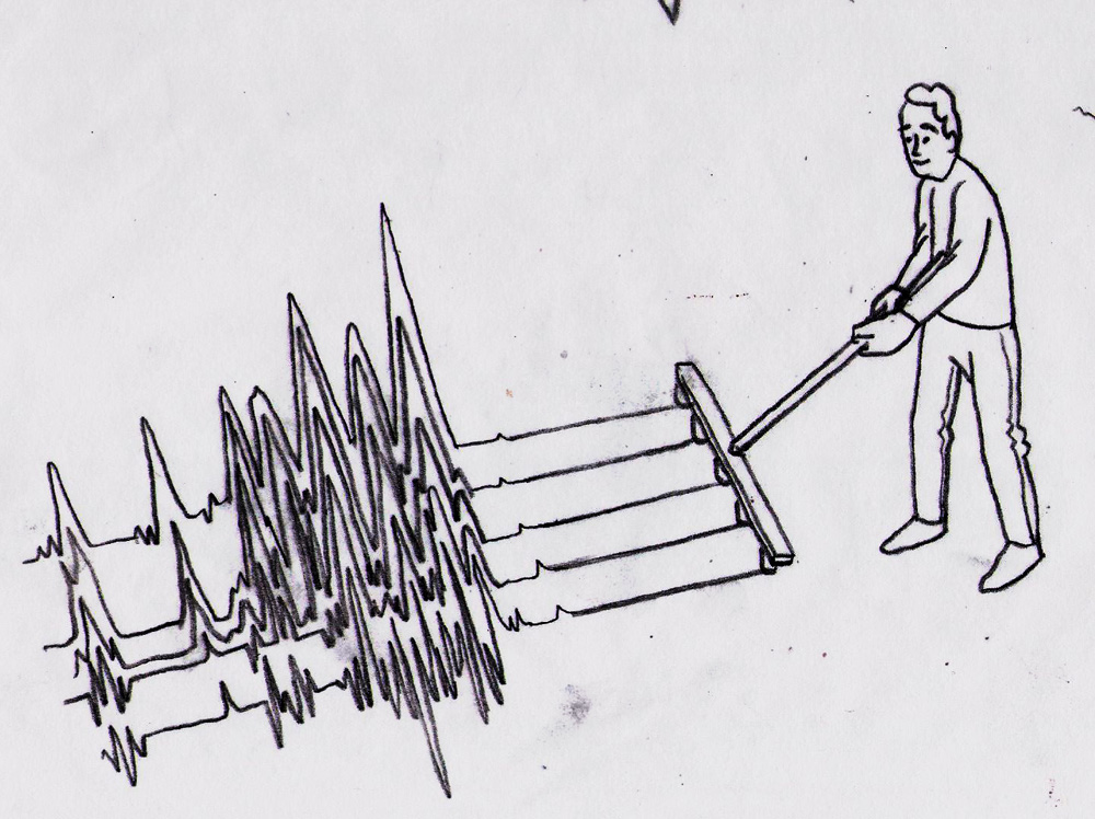
have your quake, and eat it too.


Heres an OpEd piece appearing in todays LA Times about earthquakes.
specifically, how theres nothing to really fear - in the the sense that nothing new is happening. By all means fear earthquakes, they're scary and destructive - but its certainly not the end of the world. there are no greater earthquakes happening now than ever before - its just that we're all connected so much more and living where they are much more active. This was kind of the direction pitched to me - the idea of being untouched by the calamity in remote places.
I played with that, and the idea of not fearing whats happening.
soulja boi tell em.
some other roughs:

4.09.2010

magic wand, make my monster grow


- in reference to the hit series "Power Rangers" and in no way a sexual innuendo.
In a (somewhat) related (to the title) note this was a little info-graphic i did for Cottage Life about repairing old - dried out wooden canoes. The way to fix em up is with water...obviously. because the wood shrinks when its out of water, dousing it helps it expand and fill the cracks. God, this entire post is a "thats what she said" marathon. Anyway, It was fun to show a piece in panels - step by step - and an additional challenge to really "clean up" my style. info-graphics are traditionally very clear and straight forward - so that was the tone i wanted to go for. Very fun. Im currently working on one for the next issue - involving bears!! that should be awesome. Thanks Steve!!
ok, as you were...

4.05.2010

one mans trash

is another mans treasure -
This was a rejected rough that i liked so much i wanted to make it my spring postcard.
Its hard to find the time to make promo stuff, so hopefully this does the trick :)
Thanks for reading, more soon.

4.01.2010

Ke$ha, Ipad, Lady Gaga, I.S.O

april fools!! disregard that title, more of a little game Im playing with analytics - speaking of which - i seeeee yyyyoooouuuuuuu.
...anyway - I recently did a Bunch of pieces for I.S.O&Agent Magazine (the magazine about credit card terminals and the people that sell them of course). The very nice AD approached me with some ideas - asked if i'd pitch some too and off we went. In the end the editor decided to go with their initial ideas (except for one) but I thought I'd post some of mine too. while Im not going to post everything (gotta save some for a rainy day) it was a fun project and I really pleased to have worked with them!!!
First -the coverThe AD gave me the brief of "struggling with cash" - the agents want cash and its difficult to get
There were lots of other ideas too.
Next, a spot about navigating the peaks and valleys / finding opportunity /shortcuts
this one was my idea!!!! heres some more roughs
currently being painted as a spring promo
lots of others, but this is already a longass post ... we'll do one more - save the rest for a later date
small feature about I.S.O's going global / expanding the global market - their pitched idea chosen (and not unlike one i've done before)
lots more ideas here too. Anyway, Thanks Galina - this was lots of fun!!!
more soon...

3.18.2010

apparently i like drawing pencils...


(see post below)
This piece was a spot for The New Republic about education reform and national standards. I really liked the final idea, because i wanted to focus on reform being a time of rebirth, growth, and opportunity. really amazing AD, and really amazing magazine - they use a lot of cool illustration. Thanks for reading :)

3.15.2010

MGI


I was really happy when asked if i would like to design the next promo for my rep Morgan Gaynin - They wanted an image that would show them as industry leaders. I took some time and gave it some thought and came back with the idea of an orchestra conductor (leader) but instead of holding a baton, the conductor would be holding a pencil (nice way to show leading illustration). The all female organization had the great idea to have the conductor be a woman (i had originally drawn a man (do all guys do that?)) and thus began piecing it together and drawing it out. a final cherry on top was using the morgan gaynin logo for cuff links. I was so happy with this idea, and really pleased with the execution, for a change. Thanks Vicki and Gail for asking me to represent you for once :)

3.13.2010

Wall Street Journal

So, I was pleased as punch to be able to do this recent piece for the Wall Street Journal. Its for a section written by Steve and Levi Yoder - a father and son team that discuss personal financial issues. In fact, my old pal Mike Byers did a piece for this section some time ago (which can be seen here ). Anyway, MY article was in response to the sunday letters they receive. Lots of roughs, but i really liked the idea of them responding to the specific dates the letters came in- thus a calendar, and its a well known fact that calendars look like shelves in a mailroom - so that worked nicely for the metaphor. Finally, let me just say that I started the piece around 6pm that night before it was due (noon the next day) - so a nice fast turn around meant the paint barely had time to dry (not really, its acrylic - so dries pretty fast.) ok, im done. thanks for reading.

3.05.2010

crap...

For an article about the olympic clean-up, it talked about the shock to Vancouver's waste system / the cities "eco system". Pretty gross stuff / pretty obvious solution.

3.03.2010

Oscar Charticle

I recently did a few small spots for the LATimes for a charticle about the Oscars. Seems most of my work for them involves the Oscars, but Im not complaining - its always a joy to work with Wes. All 4 were painted in about 12 hours. It was a race, but fun to push it
these first two spots were about actors and directors predicting the outcomes...
we also played with hiding the identity of the producer and then a little paining of the Oscar
finally, the whole thing laid out - believe it or not there were about 10 rough ideas per spot - some cool ideas, but like always Wes picked what would work best. Thanks for reading

2.27.2010

Gotta say...


I was pretty happy to be a part of this! First "letters" piece for the nytimes - Nice, short deadline - but it certainly does get lots of ideas flowing!! The piece was about "opinions on the healthcare summit" - Thanks Aviva, really appreciate the opportunity!!
Read more here: http://www.nytimes.com/2010/02/27/opinion/l27health.html

2.23.2010

putter' there

Just a little promo about "standing out from the crowd"