9.01.2010

Operation Ivy

Operation Ivy was a band. Fish, I'm look at you to have been a fan. This really has nothing to do with the piece, it just clearly involves the childrens game Operation ... nevermind. Ok, I got a chance to work with one of my fav AD's recently - the great Colleen Nicholson at Canadian Family. The article was called "Beat the Odds" and was about preventing childhood illness. Pretty serious content, but not impossible to approach light heartedly. This little gem of an idea was 100% Colleens, but i posted a few of my own below as well (there were way way more). If you haven't worked with Colleen send her harassing emails until you do - its a lot of fun and totally worth it. Wait ... maybe dont do that...

8.29.2010

Zero tolerance

Heres a piece I did, what seems like a VERY long time ago now, for Reader's Digest - The article was about how zero tolerance / over-reaction is making good kids seem like criminals.
because of the backlog of piece to post its kinda fun to look back now at it. I liked the final they picked, but was really hoping for the school house / jail one. oh well. i had originally painted a full final, but upon completion, didn't feel like the piece had any life, so re-approached and was much happier the second time around. Sometimes my work can get a bit messy, so due to the size that its printed i tried to keep it nice and clean. lots of ideas for this one.
( like the school zone sign, but the kid being led away in handcuffs)

8.24.2010

Leave it to beaver

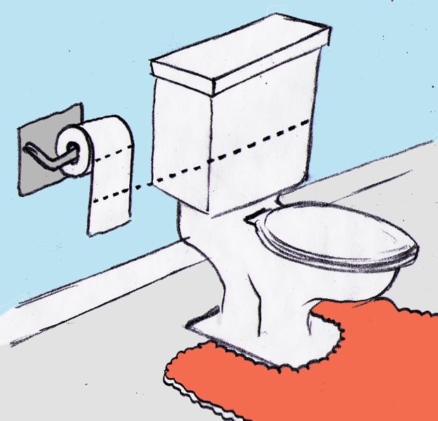
not even the best title i had. i considered Justin Beaver briefly. Anyway, heres a piece in the new cottage life about getting your toilet to use less water. lots of different ways apparently!
Im convinced cottage life's AD's have a great sense of humor - cause this sure is zany. Heres the final and some roughs

8.22.2010

me so thorny

is that title appropriate? so, i know, i said i would post way more like...two weeks ago, i mean it for reals this time. im gonna update this mother like its going out of style. so, here a piece in todays Boston Globe - its a book review for "the Pain Chronicles" a story about this really amazing womans struggle with chronic pain. shes this really positive, beautiful person on the inside, just surrounded by hurt. so check that out. side bar I've been having so much fun painting in the last few months, especially pieces like this. thanks for stopping by, more soon. heres some roughs - there were LOTS.

8.09.2010

Shady's back, tell a friend

So,
I decided to take a month away from my blog. Basically, its summer and Im a nerd. that natural combination causes an eternal war. i want to do things like blog etc. but i also want to force myself to go outside and enjoy the sun. Like this very second, i also look for reasons and ways to procrastinate. Long story short, in a whole hearted effort to seize summers embrace, as well as to focus my work time exclusively on work i took a break. A month off. So here we are 29 days later (the month off could be February) and I'm ready to pick up posting. The upside to my absence is that a surplus of pieces to post have built up, so at the very least August will be ripe with new stuff. Heres a piece i did for Wes a little while ago about the various aspects of Emmy acceptance speeches.As always, Wes is the best to work with.
Here are some roughs:

7.10.2010

flower power

This piece will be appearing in todays LATimes on the cover of the IMAGE section.
The article is about a new trend in women embracing the natural beauty of going gray.
For this image they wanted to get across elegance and feminine beauty - as Im no expert on these topics there were lots of roughs. It took a while for me to find the right tone, even with Wes suggesting cascading hair. Nice quick turnaround!

7.05.2010

Its just business... *Now with Final*


Any business work I do is probably my favorite. There are so many ways to get conceptual, but remain clear. Heres is the final rough of a recent project ( I will be posting the final final shortly) - The piece centered around banks, and how their resources are continually being "tapped" - this leads to temporary strain, but if done at the right time then given time to re-strengthen it can be a rich resource. Given the description (and lucky break that pillars look just like trees) it sounded just like gathering maple syrup. a sweet solution indeed.
It sure is fun (AND FAST) doing a bulk of my rough work in illustrator. Im jealous of the skilled illustrators who use this program on the regular.

6.29.2010

IM BACK!


Tired? Yes.
But had an amazing time! Big up's to Mark Smith - got to meet up with him for a night out of drinks and chatting about old punk rock and skateboarding- great bloke!!! Now for a little work - this piece in in the new issue of The Progressive and was about corporate criminals. I had a lot of ideas for this piece - but the briefcase doubling as a mugshot slate seemed too good to be true. painting this was also so fun - i had a few days to get it done so i took my time and really played around. some airbrushing, some stencils, some straight up brush work. Thanks for reading - lots to come!!

6.16.2010

Hot fun in the summer

This is for my summer promo postcard.
The idea was initially for another project, but wasnt chosen and i always liked it -
Im gonna go with the tag line of working together, or finding solutions / opportunities etc.
I've been painting it in my spare time for the last week or so, so overall i had more time that usual to develop it - pretty happy with it.
Also, Im going back to England on Friday for a few weeks - for Glastonbury festival (willie nelson, snoop dogg, others) so thats going to be awesome. Im also going to try to stalk Mark Smith while im there!

6.15.2010

REAL


Heres a piece appearing in todays LATimes, again for the envelope section. This time, it was Wes' idea I was illustrating. He had this image in mind and it was my job to bring it to life. Its sometimes fun painting someone elses idea - in a way it takes a bit of pressure off - and it gives you a chance to make the image as close to what they had in mind as possible - in this case, branding irons in a fire that spell R E A L. I've been working a lot on this airbrush technique and this piece offered a great venue to push it a bit further. it really works smoothly with the texture that comes from silkscreening. heres the image and a little detail of the texture.
Thanks Wes!!
oh and everyone check this out: http://hawkandsquirrel.wordpress.com/ its a fun illustration podcast some friends have put together

6.01.2010

Junebug


Heres a piece appearing in todays LATimes.
The article is about how tv is changing, and the audience has more say than ever.
Programs are listening to feedback and episodes are being tailored to popular opinion.
some roughs: