10.01.2010

Mao Mao Mao

Op-ed running in the LATimes today about the Chinese Communist Party "adopting" many of the ideologies of Confucianism - in an attempt to bridge many of the serious gaps plaguing the country. Long sentence ... sorry. Essentially, the solution is a bit suspiciously convenient. Man this painting went late - but its great to work at that time of night - the city gets so calm. Drawing Confucius' mustache on Mao was my favorite idea, so i was thrilled Wes went this way - here are some of the other roughs too:

9.25.2010

thunder struck

(ever notice my shadows make NO sense??)
This piece was for Leap Magazine, Alberta Cancer Foundations magazine, put out by the great people at Venture Publishing. The article was called "the science of stress", and basically went into the health and personal dangers stress causes. Even though its very serious subject matter, i had some fun playing with depicting stress, and its consequences. Nice, fun piece to paint, so big thanks to them for thinking of me for this project. On a side note, nonslick is getting a bit more help (Mark and I are falling behind) as friend and fellow illustrator Daniel Fishel has agreed to join the team and help us conduct some interviews. I'd really like to add at least one more person, so, if you'd like to reach out to other illustrators and discuss their work with them get in touch with me.
Here are some of the roughs that were submitted:


9.18.2010

bully


My titles suck.
So, this piece was for byFaith Magazine. Its a Christian magazine that tackles everyday subject matter. In this case, Wall street's possession of the housing market, among other things. my initial stab at roughs was way off - as i wasnt focusing on wall street, or housing, but rather the strong element of materialistic Christianity found in the article, as well as the tendency to put money and spending ahead of their faith. so I sent some roughs in, heres a look...those, and others were turned down, and i was given some thoughts on what i should focus on and a bit more of idea of what they were looking for. I had some clear ideas of ways I'd like to show wallstreet, as well as the role they played in the mortgage meltdown, and their possession of so much real estate. so, i submitted more roughs (that i might just hold onto for now) and my fav was picked. a bull wearing a (house like) cowbell seemed like the perfect way to show the possession and control, so i was happy. Like most pieces, i tried some new techniques. My hope was that the viewer would be drawn to the eye / face area of the bull and almost notice the bell secondary. So, I kept the colours similar, except for the blue. I wanted him to looked a bit pissed, but more powerful than anything else. really fun to paint
thanks for visiting. oh - and check out the FANTASTIC layout up top!!!

9.13.2010

and then there was light

heres a little spot i did for Treasury & Risk Magazine. The piece was about people whistle blowing solely for the cash incentives. The kicker, is that those being caught arent necessarily upset, they can get a cut too. its all loco.

9.09.2010

Run away train, never coming back

Heres a piece i did last month for New Jersey Monthly about this train line called "The Dinky". Its this really little train thats been running to Princeton since, like, 1839 and its going to be replaced with a bus service. The article title "Death of the dinky" really says it all - making the solution of a train speeding into a tunnel / grave a pretty obvious one - they are the same shape after all. Pretty sad article considering its rich history. Very rarely do i have to paint things that looks like they do in real life, so this was a fun challenge.
I have to say too, the AD for this was THE COOLEST.
Gregory is a former hardcore kid, still straight edge, and we've had a lot of fun talks about music, concerts etc. Really hope i get to work with him again in the future, but in general, all around super rad guy!!
some roughs:
there were lots of other "death / grave ones"

9.05.2010

if you build it...

This should be in todays WSJ - an overnight about how workers help build investments.
it appears REALLY small - like 2.5 by 1.75 - so i wanted it to be pretty bold and easy to read. these fast turnarounds REALLY make you think on your feet and I was super happy with the solution. In other news it seems like fall has crept up on us. Stay warm with handmade vintage fur headbands, by headmistress here <--- Oh come on, its my girlfriends company, i have to plug it from time to time.

9.01.2010

Operation Ivy

Operation Ivy was a band. Fish, I'm look at you to have been a fan. This really has nothing to do with the piece, it just clearly involves the childrens game Operation ... nevermind. Ok, I got a chance to work with one of my fav AD's recently - the great Colleen Nicholson at Canadian Family. The article was called "Beat the Odds" and was about preventing childhood illness. Pretty serious content, but not impossible to approach light heartedly. This little gem of an idea was 100% Colleens, but i posted a few of my own below as well (there were way way more). If you haven't worked with Colleen send her harassing emails until you do - its a lot of fun and totally worth it. Wait ... maybe dont do that...

8.29.2010

Zero tolerance

Heres a piece I did, what seems like a VERY long time ago now, for Reader's Digest - The article was about how zero tolerance / over-reaction is making good kids seem like criminals.
because of the backlog of piece to post its kinda fun to look back now at it. I liked the final they picked, but was really hoping for the school house / jail one. oh well. i had originally painted a full final, but upon completion, didn't feel like the piece had any life, so re-approached and was much happier the second time around. Sometimes my work can get a bit messy, so due to the size that its printed i tried to keep it nice and clean. lots of ideas for this one.
( like the school zone sign, but the kid being led away in handcuffs)

8.24.2010

Leave it to beaver

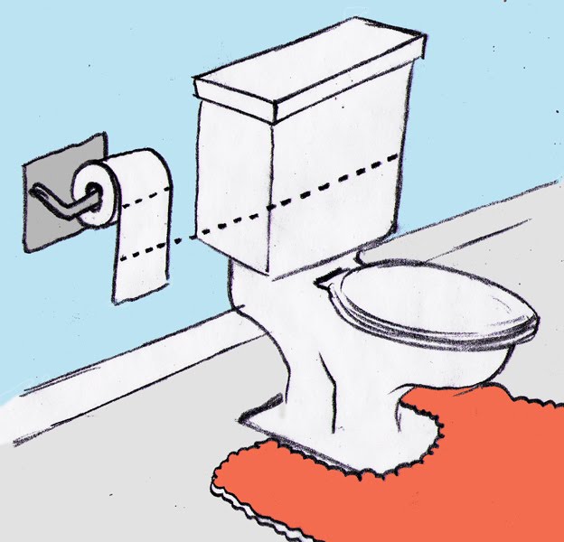
not even the best title i had. i considered Justin Beaver briefly. Anyway, heres a piece in the new cottage life about getting your toilet to use less water. lots of different ways apparently!
Im convinced cottage life's AD's have a great sense of humor - cause this sure is zany. Heres the final and some roughs

8.22.2010

me so thorny

is that title appropriate? so, i know, i said i would post way more like...two weeks ago, i mean it for reals this time. im gonna update this mother like its going out of style. so, here a piece in todays Boston Globe - its a book review for "the Pain Chronicles" a story about this really amazing womans struggle with chronic pain. shes this really positive, beautiful person on the inside, just surrounded by hurt. so check that out. side bar I've been having so much fun painting in the last few months, especially pieces like this. thanks for stopping by, more soon. heres some roughs - there were LOTS.

8.09.2010

Shady's back, tell a friend

So,
I decided to take a month away from my blog. Basically, its summer and Im a nerd. that natural combination causes an eternal war. i want to do things like blog etc. but i also want to force myself to go outside and enjoy the sun. Like this very second, i also look for reasons and ways to procrastinate. Long story short, in a whole hearted effort to seize summers embrace, as well as to focus my work time exclusively on work i took a break. A month off. So here we are 29 days later (the month off could be February) and I'm ready to pick up posting. The upside to my absence is that a surplus of pieces to post have built up, so at the very least August will be ripe with new stuff. Heres a piece i did for Wes a little while ago about the various aspects of Emmy acceptance speeches.As always, Wes is the best to work with.
Here are some roughs: