6.14.2011

Alberta Oil

A few months ago I was contacted by Alberta Oil to make some pieces for an upcoming issue. For the last year or so, i've tried as much as possible to take a real "try anything" approach when it comes to execution. Not at the expense of the piece - but finding the right tone and delivering that. This has resulted in work that is very graphic - to much more painterly. Consequently, these four piece each look a little different. So be it.
First article was about the oil industry in Alberta "growing up" - aging - evolving etc. this could have been cool - but just wasnt clear enough - wanted to show a kid growing up, leaving their sandbox - sandbox to represent dig sites. ...in hindsight maybe it made no sense?we ended up going with removing the training wheels from one of those massive dump trucks - seemed like a fun solutionNext article was about the cost of eco drilling - sort of a split article, because it was pro eco - but really wanted to stress the coststhe final was cool - i like painting money - and i like juxtaposing "real" with graphicNext was about this energy project in Newfoundland that involves building a hydroelectric dam. the issue - is that there is a lot of risk involved - maybe people wont buy the electricity - and its a big investment. I'm a really big fan of Tim O'Brien, and more "realistic" painting in general. Not that i can do it at all - but im always really inspired to inject a little bit more of that into my regular work. I try to be really careful with this though, as i dont want to step on anyones toes - people that may already work in this manner. its not super obvious in this rough, but i wanted the crack in the dam to be shaped like a lightening bolt - really liked the idea below, with the puffin trying to fly away (nflands "official" bird) and he is tangled in the wire / being held back a little - seemed perfect. I had a few more generic ideas too - heres onethen for the final my pitch of "painting a worried puffin, with electric outlet feet" was good enoughFinally, the last piece was a spot about "risky oil" ventures - Investors could sink their money into a refinery, but it might make them broke. some fun roughs for this one - but i'd like to hold onto them for a future project - heres that final: - the sky was really fun to screen.

6.07.2011

hammer time

sample type layout above ^^
full pager for Canadian Wildlife about sustainable building projects

6.04.2011

i like to move it, move it...

Here was a piece in todays Washington Post. It's about people, who's possessions are held hostage by movers they hire to help them move. Basically, the moving companies quote one price, and then once at the new home demand much more or they'll keep the home owners stuff. i really liked the idea of people's stuff being held hostage, or for ransom. the people are really trapped by the proposition. what are you going to say, "I dont want my stuff!"?? theres really no choice in the matter. Heres some ideas i had going in -I really liked the above idea, and pushed for it. Thankfully, Diamond the AD knew better.
She liked the idea of having the home owner in a jail - or at least trapped - and with this idea we moved forward a bit. here was the first attempt:Diamond wisely suggested that we make the person two people - and add a mover and moving van in the background. good ideas! Heres that revised rough:I've noticed my work getting much more ... comic-ee looking lately - that might not be the term i'm looking for, but its looking different. at first, i wasnt sure if i liked it - but im starting to. Who knows how long it will look like this, but its fun for now. (note, it may look NO different to you, the reader - I'm just a weirdo)

5.30.2011

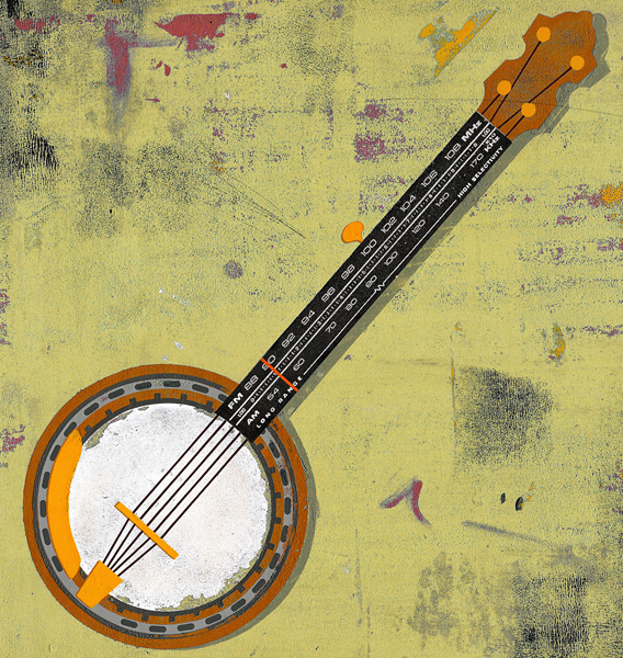
Banjo Kazooie

Small piece i did for this months Cincinnati Magazine about a radio program dedicated to bluegrass music. What other solution is there? They mentioned that they wanted the piece to be really grimy, i was happy to oblige. Heres the original bg color (above) - and one i changed in photoshop to a kinda neutral greeny - yellow (bellow). I offered over both, cause i thought each one was kinda cool - but would be curious which one you find more effective, at such a small print size. Really great working with Cincinnati Mag again - they're great!
June is almost here, can you believe it?!! Time flies...

5.22.2011

know your role...

This piece is appearing in todays WSJ - about people investigating, and ranking their neighbors home. I tried a bunch of different options for both aspect (have added a couple of roughs below) - but really liked the idea of judges scoring. Fun, piece and great to work with Mark again.

5.21.2011

More than you expected

My summer postcard, with the tag line "More than you expected"
Please let me know if you'd like one :)
Thanks for stopping by.
I love you.

oh - i was also screwing around with how it could look as a book cover (because it would be fun to do some of those) - so i very poorly threw this together...

5.18.2011

what the devil

Sorry for the lack of posts - this month has been nuts - i'll make sure to be more attentive for the rest of the month! This was a full pager for HR magazine - about ethics tests revealing the true nature of potential employees. Such a nice magazine to work with! A couple of roughs below:

5.04.2011

book learnin'

Some ideas are head and shoulders above other you have. it's really exciting when these happen, because it isnt all the time. for some reason, i felt that way about these two -
both for the new issue of Education Forum, the first - about Standardized Testing and how TEACHERS are being punished for their students low test scores - the F matches the smack across the back of the hand

Next piece was about debating - im really hoping someone didnt have this idea first - i thought it was super fun.Big thanks to Fresh Art and Design, some of the best people to work for!