5.20.2010

new cottage life

i did a few more of those info graphics in this months cottage life ... at least thats what they initially were ... the pieces took some unexpected turns. first, there was a small piece about environmentally friendly BBQ's. pretty straight forward - heres some roughs - there were tonnes for these projects, so heres just a taste:

heres the final:and the layout:
and here's where it gets a little wild - this next one was meant to be a straight up info piece showing a bear a cottage and an electric fence - heres where we began:

then I thought it would be fun to include a funny one of the bear testing the fence...
then it was suggested that i draw the bear doing a sort of limbo under the fence...ok, that could be funny...
then it was suggested that it would be even funnier if we ditched the cottage in the bg. and focused on the bear, the limbo and toss in a hawaiian shirt and a fun drink, and so...
its true, it is pretty funny. and it looks nice in the layout:
Thanks as always to Steve - he's clearly a very fun AD - who else would go in this direction??!?!

5.17.2010

shake your booty

Heres a taste of a recent large project I finished up recently. I'll have some time later this week or next to post the whole enchilada, but for now this'll have to do. I will say that this project was great, I was able to take to finish some ideas i was really excited about - and also really push my approaches, both painting and screening. This particular piece was about how direct mail / letters in general is a great way to introduce your self to new clients / prospects. I was so happy this solution was chosen. Mary the AD was amazing and i wish every illustrator had the good fortune to work with someone like her.

5.13.2010

nuclear and present danger...

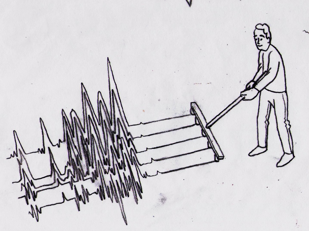
Heres an op-ed i did running in todays LATimes - the story was about how its very dangerous for women sailors working on submarines, due to the high level of radioactivity. it focused on the damage done to the reproductive organs - and a few of my roughs focused on that - but the overall theme was the general danger the nuclear energy has on women - so thats the way we went. Wes, who is seriously the greatest AD had some fun ideas on the layout - which happened to work well with the chosen idea - of having the periscope travel up to the top of the text. Like every op-ed the turn around was pretty fast, but Wes made it smooth and easy.
heres the main part of the image:
heres a close-up - yep, im airbrushing in pieces now :)
a rough of the layout - i'll post a proper pdf as soon as i get one:
some roughs:

Thanks as always to Wes, and to you for reading.

5.03.2010

im with the (broad)band

This piece was for CIO about how broadband is offering opportunities to those living in inner cities. the idea is that the computer world can offer more than the real world can to them. i really like working with Terri, shes amazing and was kind enough to give me a few extra days which i used to have some fun painting. Thanks Terri for the great assignment and thanks to the band WAR for some inspiration for the neighborhood! - couple of the roughs i sent in

4.27.2010

children behave

heres a recent piece done for Adweek. now, its kinda a complicated image - basically adweek was doing a monthly review and the issue ended with the theme "What kids want". The AD wanted one image that would cover three completely different subjects. the first subject - how 2nd tier media companies are able to stand up to first tier ones - 2nd tiers arent standing in the shadow, but rather on the shadow even steven . the second - was children's influence on parents purchasing habits - and even in a recession kids generally make a majority of buying decisions. and finally, the medias impact on childhood obesity and its responsibilities. tying all of this together in one image was a bit tricky. Ron the AD had the great idea of using a triptych - one image broken into 3 parts - tied together by colour scheme - shape etc. each indavidual section was treated like its own illustration with plently of roughs etc - then when we had our set directions i worked on drawing them so that they fit together. the final piece i think is pretty successful and i was able to try / push some new techniques.
you can read more here if you like. Thanks Ron - lots of fun working with you!!

4.19.2010

two for one...

heres a couple of small pieces recently -
The first for Milwaukee Magazine about the city being lumped into a real estate survey with some other, larger cities. Sort of the odd man out. heres the piece and the layout - i wont trouble you with roughs, but there were lots. - got to do some block printing in this piece, so that was fun
the second piece is for BCBusiness with the specific brief of "sharing green ideas". it appears very small so i wanted it to be clear. usually that means something graphic in my mind. heres the final and a few roughs:
sidebar - this thursday is the Sheridan Grad show - i hope everyone that can makes it out and supports these new grads!

4.14.2010

have your quake, and eat it too.


Heres an OpEd piece appearing in todays LA Times about earthquakes.
specifically, how theres nothing to really fear - in the the sense that nothing new is happening. By all means fear earthquakes, they're scary and destructive - but its certainly not the end of the world. there are no greater earthquakes happening now than ever before - its just that we're all connected so much more and living where they are much more active. This was kind of the direction pitched to me - the idea of being untouched by the calamity in remote places.
I played with that, and the idea of not fearing whats happening.
soulja boi tell em.
some other roughs:

4.09.2010

magic wand, make my monster grow


- in reference to the hit series "Power Rangers" and in no way a sexual innuendo.
In a (somewhat) related (to the title) note this was a little info-graphic i did for Cottage Life about repairing old - dried out wooden canoes. The way to fix em up is with water...obviously. because the wood shrinks when its out of water, dousing it helps it expand and fill the cracks. God, this entire post is a "thats what she said" marathon. Anyway, It was fun to show a piece in panels - step by step - and an additional challenge to really "clean up" my style. info-graphics are traditionally very clear and straight forward - so that was the tone i wanted to go for. Very fun. Im currently working on one for the next issue - involving bears!! that should be awesome. Thanks Steve!!
ok, as you were...

4.05.2010

one mans trash

is another mans treasure -
This was a rejected rough that i liked so much i wanted to make it my spring postcard.
Its hard to find the time to make promo stuff, so hopefully this does the trick :)
Thanks for reading, more soon.

4.01.2010

Ke$ha, Ipad, Lady Gaga, I.S.O

april fools!! disregard that title, more of a little game Im playing with analytics - speaking of which - i seeeee yyyyoooouuuuuuu.
...anyway - I recently did a Bunch of pieces for I.S.O&Agent Magazine (the magazine about credit card terminals and the people that sell them of course). The very nice AD approached me with some ideas - asked if i'd pitch some too and off we went. In the end the editor decided to go with their initial ideas (except for one) but I thought I'd post some of mine too. while Im not going to post everything (gotta save some for a rainy day) it was a fun project and I really pleased to have worked with them!!!
First -the coverThe AD gave me the brief of "struggling with cash" - the agents want cash and its difficult to get
There were lots of other ideas too.
Next, a spot about navigating the peaks and valleys / finding opportunity /shortcuts
this one was my idea!!!! heres some more roughs
currently being painted as a spring promo
lots of others, but this is already a longass post ... we'll do one more - save the rest for a later date
small feature about I.S.O's going global / expanding the global market - their pitched idea chosen (and not unlike one i've done before)
lots more ideas here too. Anyway, Thanks Galina - this was lots of fun!!!
more soon...