6.25.2008

artistaday.com


hey i was featured on artistaday.com, a very very cool website - although the feedback was minimal it was good and it made me really happy!

6.24.2008

hey hermano(s)


Im working on a really cool illustration right now about "investigating the new blackberry and i thought id post the sketch work...you know...just to keep things fresh. also will be sending out my first mailers this week which i am excited about - the whole sorting through magazines thing etc is such a nightmare. THERE ARE SO MANY PUBLICATIONS. thank god im style locked into a select few! (truth disguised as joke) anyway - i'll post the final as soon as i can - im painting it tomorrow. WOOT!

6.16.2008

ishmael


i recently did this illustration as a book review / commentary on the novel ishmael. first off, i REALLY liked the novel - even the very obvious ending. i thought alot about how i wanted to portray ishmael.
huge - but vulnerable. hulking. most importantly trapped - but not in a
conventional way - you see, obviously he understood how to be free and
how to save - yet he was still a captive. i tried to play with this
idea, extending the bars that confine him only to theparameters of his frame. so technically he's free - but obviously he's trapped.
woooooooooooooooooooooooooooo
freaky

somehow this never got posted


better late than never

6.11.2008

SO AWESOME


i was featured on drawn.ca!!! its such an awesome site and i was so happy to see it!!!
AWESOME!!!
oh - and lots of new illustrations to be posted here soon. im just not able to post some of them yet...but soon!!

6.03.2008

more mapmusic stuff


more logo stuff for map music, pretty simple but fun to do.

5.27.2008

the cost of raising kids


for an article about the cost of raising kids. Tried some new stuff which was great and this was the first time i have made an image that just sits in white space. whatever the client wants right?! fun project!!!

5.20.2008

this and that with design


so I've been doing alot of random design work since ive been in montreal. its really fun stuff. i know i know - but pete - you're an illustrator!! well i'll be posting new illustrations soon too - so chill. maybe even some sketchbook stuff. im serious. updated ALOT.
this was for mapmusic.org. its bsically this guy named robbie tucker who's raising money for research. the design was pretty simple for me - basically setting some type, getting rid of the previous logo on his shirt and the smudges on his guitar. fun part was coming up with a simple "hero" logo for mapmusic -heres the before and after - it was really fun to get to work with this guy and work with such a cool picture.
oh and BIG news soon too this week!

5.18.2008

update


sorry for the lack of updates post school - ive just been so busy. in montreal right now - thats awesome - been having alot of fun! i am going to be updating way more as ive been busy illustrating - but just doing random things too. oh and these were cool
!\\

4.20.2008

website!!!

my website is up - its a little small and might be rebuilt soon - but it works and im happy about that.

peterthomasryan.com

exciting times!

4.13.2008

4 of 6 ... or something like that ... i cant remember


this is a piece for the series im working on about the womans life.
this was about a small business she ran. in our conversations she told
me that although she worked hard and made money she was paying out what
she was receiving. almost like she was a filter for the money - it was being slipped into her hand on one end and slipped out on the other.

theres also a quick second of it in context to an ongoing project - there is type to be placed that i will post...once placed

i had alot of fun painting the money and hope to incorporate more stuff like that into my work.
all acrylic

4.06.2008

waiting


this is the front side of the mailer im putting out this spring - i'll post the reasoning and the printed version in a week or so. there is also the cropped - colour corrected version above
im pretty happy with how it looks and its going to be really exciting to have these to handout at our grad show -
WHICH EVERYONE SHOULD COME TO!

3.30.2008

6 of 6 in the series


this piece is the sixth panel in the series and like the first one is subject to change slightly when put in context with the series - it discusses the womans ideology that cancer saved her life by giving her a second chance. theres alot i wanted to do with this one. first and foremost it was important to me that the amount of water she be surrounded by be infinite. i think thats important because it shows the dependency on the lymphoma ribbon life preserver - without it (the aspect of her life) she'd be a goner. in contrast to that it also establishes a sense of peace - i guess thats reinforced by the expression on her face. i also wanted to find a good balance of how much the life preserver looks like the ribbon and vice versa - i think i found a nice balance. i'll post the others in the series this week sometime
painted acrylic


EDIT* - i have added the revised final at the top. the changes were pretty minimal and really included adding some more water ripples at the bottom and a horizon line at the top. it was a big choice but i think benefits the piece both ascetically and emotionally.

3.26.2008

1 of 6


this is the first in a series of six. the subject is of a woman dealing with / and carrying around her emotional childhood.

i'll post the others this week, its just been super busy.
painted in acrylic.
oh - it might also get modified slightly when the last ones are finished - if needed - but thats more or less it.

2.20.2008

working


so heres the final. i took a few days away from it because i was starting to hate it - but im really glad its done and think it turned out awesome. i put it next to the "rough" to get an idea of where i began to where i finished as this post started as a process post. the eyes took a long time to paint. jeeez, but i got the effect i was hoping for. man, i have SO much work to get done before school ends - so i guess ill be posting more in the next few weeks. - i guess keep an eye out for that

2.05.2008

RABEEZ


this is a 5"by5" spot about rabies. essentially the article discussed ways of getting rid of rabies through information and education.
i thought it was cool to "erase" the problem.
acrylic.

theres also an alternate version

1.15.2008

first of 08'


so its 2008. hence the title of the blog. this is the first finished bit of illustration i've done. its for the cover of the magazine "travis". the two main focus' of the month of february are "going green" (ways of becoming more earth friendly) and valentines day. the challenge was to synthesize the two to create an image that speaks of both.
im very happy with the way the final turned out and will post a jpeg of it when its placed within the context of the magazine.
s'all acrylic.


*edit*
added recently is the in print version of the illustration. to really fit travis i worked into it digitally a bit and really saturated the colours. the whole idea is to make people want to pick it up.
its different from the origional in some ways but in alot of way i think its just stronger. hopefully it will be effective

12.06.2007

the willies...


so this piece is for a "heaven and hell" project. like always i found a cool article about how country music is turning rock to stay popular. its sad times when hank williams cant do it for you anymore. so the obvious illustration solution for me was to paint willie nelson dressed up as gene simmons. this was so much fun to do.
its all acrylic silk screened and painted by hand blah blah blah.

12.01.2007

think thin


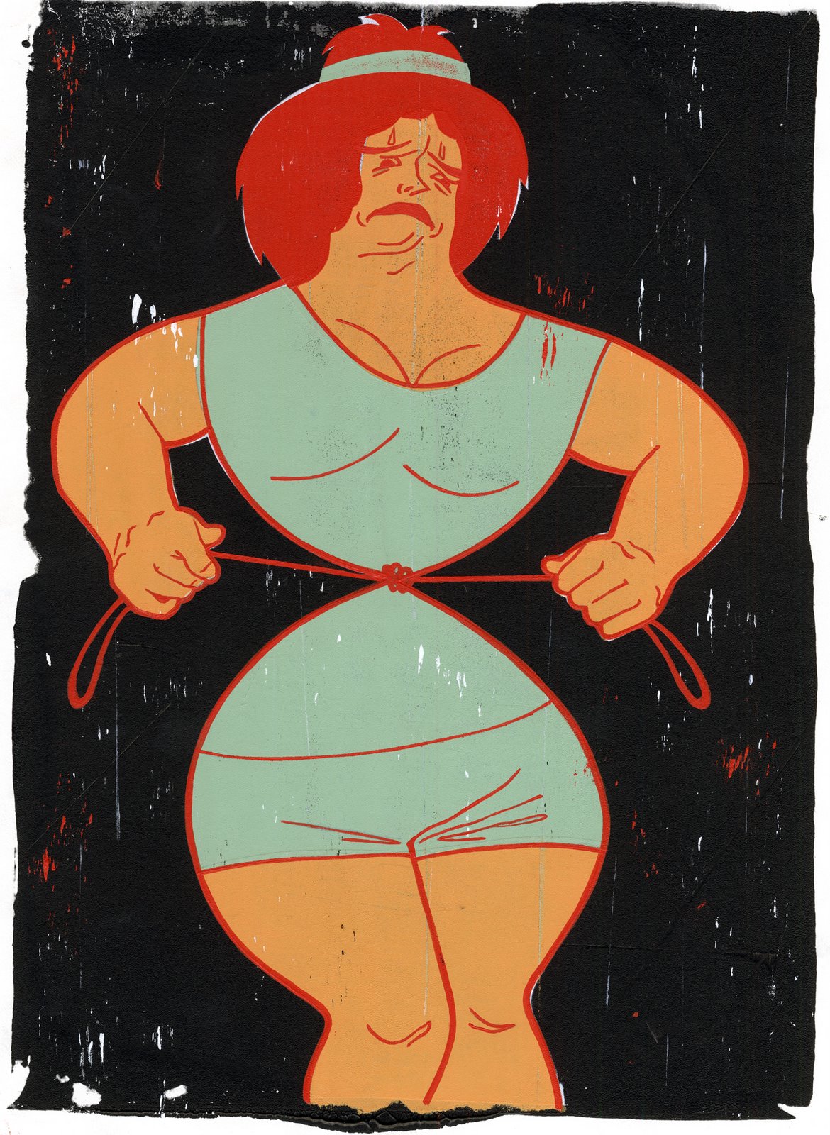
this was for a book titled "the desperate womans guide to diet and exercise". the idea is that a desperate woman is going to go to any means necessary to get thin - thus is tying herself up nice and tight.

TIGHT!

11.23.2007

new project


This is pretty fun - basically the project was to illustrate the palindrome "stressed desserts". I was told to find a secondary source of information to give the work some depth. I found this great article about how men lose their sex drive with age. Seems pretty self-explanatory from that point. In crit it was pointed out that it would be cool if the candle had a slight curve. Would have been cool - but I think this still totally stands up. Pun intended