

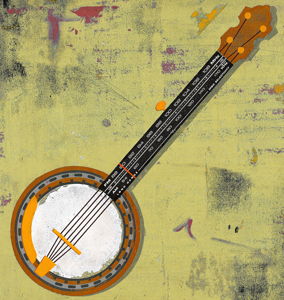
 Small piece i did for this months Cincinnati Magazine about a radio program dedicated to bluegrass music. What other solution is there? They mentioned that they wanted the piece to be really grimy, i was happy to oblige. Heres the original bg color (above) - and one i changed in photoshop to a kinda neutral greeny - yellow (bellow). I offered over both, cause i thought each one was kinda cool - but would be curious which one you find more effective, at such a small print size. Really great working with Cincinnati Mag again - they're great!
June is almost here, can you believe it?!! Time flies...
5 comments:
What a great idea!! Well done Pete!
i prefer the blue - i think the contrast with the browns & yellows on the banjo works better.
Blue makes it pop more.
thanks for the feedback guys!
I think i agree about the blue...
Love it, really striking!
Post a Comment