Hello friends,
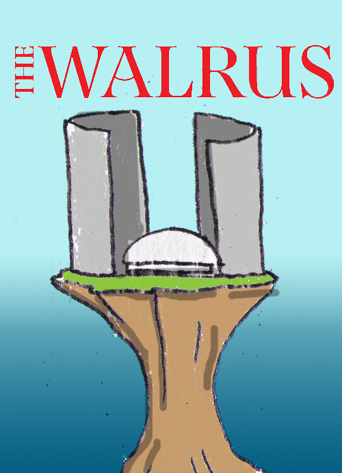
Yes, it's been a while since my last blog post. Just had a lot going on in the past month, but i'm going to try to cram a few posts in before the end of the month. So, seemed the easiest way to get back into the swing of things was to post a recent failure. Well ... not failure exactly, but something that didnt quite work out. I was asked by my friends at the Walrus (again nepotism) to pitch some ideas for their upcoming cover. They werent totally set on illustration, so i would really need to sell it. The subject matter was about how Toronto has come up short. In a broad sense, its failed to reach its potential - or i should say, while it once had the makings of a great city, a lot of factors over the years has left its ambition limp.
this might be the first time i had a completely clear idea immediately.

for those of you who arent familiar with Toronto landmarks, that idea depicts the Toronto national tower (until recently the tallest freestanding structure in the world ) and the skydome (now known as the rogers center)

- HAVE ANY TWO BUILDINGS EVER LOOKED MORE LIKE MALE GENITALS ?!?! - what a perfect idea then to show the tower "going limp" - and not to sexualize it, but to clearly associate it with the concept of impotence. At least in my mind it seemed clear as day. Like always, i mocked up a good number of other ideas using other toronto icons (our coat of arms, our city hall - which is kinda dome shaped with buildings on either side, even our baseball team - the bluejays (our hockey team "the leafs" need no additional mockery) and one i really liked - about our transit system known for its intense over crowding) - In the end the cover went in a very different direction. I was thankful for the opportunity to share my ideas, and it was really nice of my friends to think of me for the project.


I was thinking of doing a run of limited edition silk screen posters with the image, but realized the demand might be too localized to be worth it, or more likely - there would be no demand at all - ha.
thanks for reading, more soon...


 first piece was work Moneywise UK - it was a sequel to a piece i did for them this time last year - a follow up. The original piece depicted a man dipping his toe into an investment pool - testing the water, or whatever. this one they wanted to show the same guy leisurely floating in the water, clearly having had a good year. I liked the idea of following up the image - but i thought i'd pitch a few new directions for the piece - just in case: i really liked the idea of having the water floaty things be like an abacus


 This second piece was for Investment Advisor - heres the explanation i sent with the rough: I liked how the article mentioned segmenting and focusing on specific areas for best results. - man (firm) juggling numerous balls which also double as centers of a target - the balls are different colors to represent different areas -
 there were a few different places in the article i could have taken it, and the roughs reflect that.


 I like the line-work in the final, and hope to keep that or more in the pieces im working on right now. Thanks for reading