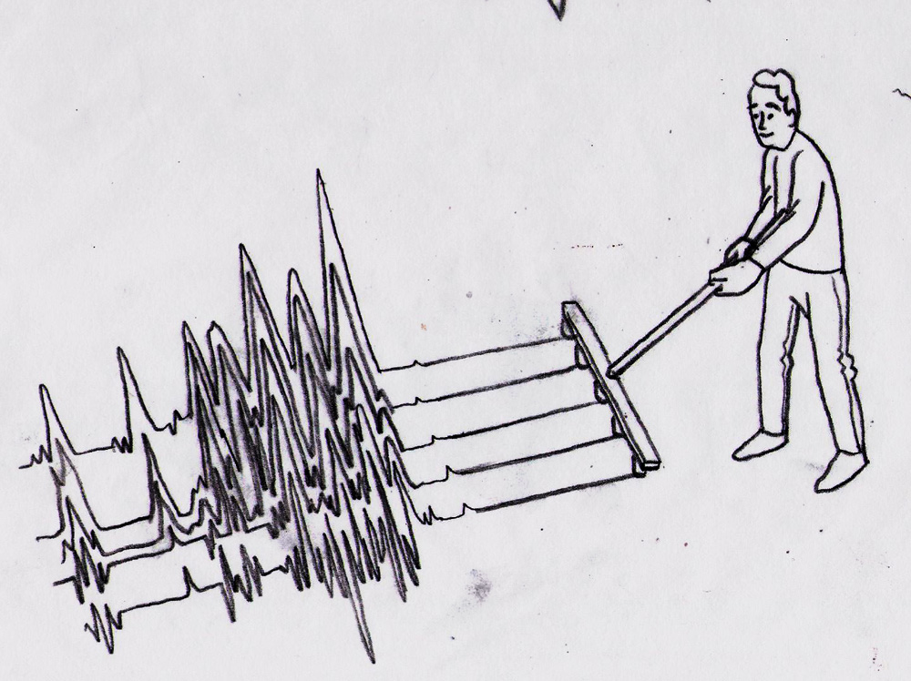
heres a recent piece done for Adweek. now, its kinda a complicated image - basically adweek was doing a monthly review and the issue ended with the theme "What kids want". The AD wanted one image that would cover three completely different subjects. the first subject - how 2nd tier media companies are able to stand up to first tier ones - 2nd tiers arent standing in the shadow, but rather on the shadow even steven . the second - was children's influence on parents purchasing habits - and even in a recession kids generally make a majority of buying decisions. and finally, the medias impact on childhood obesity and its responsibilities. tying all of this together in one image was a bit tricky. Ron the AD had the great idea of using a triptych - one image broken into 3 parts - tied together by colour scheme - shape etc. each indavidual section was treated like its own illustration with plently of roughs etc - then when we had our set directions i worked on drawing them so that they fit together. the final piece i think is pretty successful and i was able to try / push some new techniques.
you can read more here if you like. Thanks Ron - lots of fun working with you!!